

By Maria Fernanda Ibarra Gutiérrez
This blog looks at the ways in which scatter plots can be used to visualise multiple sets of data and the relationships between several variables. It takes a data set and deals with outliers, formatting the graphs for clarity, using bubbles to show a third variable, adding regression models and trend to the plots and splitting the data into separate graphs to change the focus from the whole data set to portions of it.
A scatter plot is a type of visualization mainly used to display the relationship between continuous variables. A specific variation of scatterplot is a bubble chart, also called a weighted scatterplot, which is used to plot three variables in which one of them is depicted by the size of the bubble. Even though a scatterplot can be used to compare one continuous and one categorical variable or two categorical variables, there are better graphics to depict these kinds of variables for instance geom_jitter, geom_count, or geom_bin2d. To work with a scatter plot, I will use the ggplot2 package of R. To go deep in the understanding of this package you can review the cheat sheet for further information (RStudio, n.d.)
In order to show how to make scatter plot visualization, I will use a dataset which gathers information from 2013 to 2015 of three Mexican censuses; the National Census of Federal Justice Procuration, the National Census of State Justice Procuration and the National Census of Government, Public Security and State Penitentiary System which were conducted by the National Institute of Geography and Statistics in Mexico (INEGI, n.d.). Using the data from these databases, I will explore the relationship between victims and defendants’ rate in femicides, the crime of murdering a girl or woman.
Firstly, I needed to install the tidyverse package which includes the ggplot2 package. Then I uploaded the database and corrected and changed some of the variable names.
require(tidyverse)
#Database
bd <- read.csv(paste(input, "bd_femicides.csv", sep="\\"), as.is = T, stringsAsFactors = F)
view(bd)
In general, ggplot2 package uses the grammar of graphics to depict a plot, in which we need to define some components to display the graphic such as data, the geometrical function to represent data points, in this case, geom_point since I will work with scatter plots and a coordinate system. Also, we should add aesthetic properties such as size, shape and colour of the points. Further arguments could be added to the graphic such as labels, legends, themes and facets to enrich the visualizations.
Firstly, I will show the most basic way of making a scatter plot. I defined the database and the geometrical function with the aesthetic argument with the variables for the axes and the colour of the points. The resulting figure only shows the data and the default names of the axes.
ggplot(data=bd) +
geom_point(aes(x = vict_rate , y = defendant_rate), color ="steelblue4")

According to figure1, there is an outlier in our dataset that affects the visibility of the rest of the points which take lower values in both axes. In order to improve the visualization of the data, I divided the information into two groups, one with all of the observations and another without the outlier. I required the package gridExtra to use the function grid.arrange to depict both graphics in the same grid. The syntax of both graphics are based on the same structure as the previous graphic, nevertheless, I added in the aesthetic argument the size of the plot, labels for the title, subtitle, axes’ names and caption and I added a theme to customize the background of the grid.
require(gridExtra)
p1 <- ggplot(data=bd) +
  geom_point(aes(x = vict_rate , y = defendant_rate), color ="steelblue4", size = 3) + #Add a size of the point
  labs(title ="Justice for femicide victims", #Add title
       subtitle="Femicide victims vs Defendants rate", #Add subtitle
       x = "Victims per 100,000 women", y = "Defendants per 100,000 people", #Add names of axes
       caption = "Source: Census INEGI 2013, 2014 and 2015") +  #Add name of source
  theme_minimal() #Add theme

#Plot without outlier
sub_bd<-subset(bd, bd$vict_rate<10 )
p2 <- ggplot(data=sub_bd) +
  geom_point(aes(x = vict_rate , y = defendant_rate), color ="steelblue4", size = 3) + #Add a size of the point
  labs(title ="Justice for femicide victims", #Add title
       subtitle="Femicide victims vs Defendants rate", #Add subtitle
       x = "Victims per 100,000 women", y = "Defendants per 100,000 people", #Add names of axes
       caption = "Source: Census INEGI 2013, 2014 and 2015") +  #Add name of source
  theme_minimal() #Add theme
I saved these graphics in objects p1 and p2 and I set an arrange of one row to show both objects with the function grid.arrange.
p3 <-grid.arrange(p1, p2, nrow = 1)

As shown in figure2, I have improved the graphics to understand the context of the information. However, we are plotting about three years of information, but this is impossible to distinguish in the previous graphics so further improvements are required.
From this part of the tutorial, I will only show the syntax and graphic of the dataset without the outlier point because this will be more useful to depict the scatter plots.
The next change will be focused on distinguishing the year of the data. Based on the previous graphic syntax, I added the colour of the dot regarding the year in the aesthetic argument and a new line with the scale_color argument to manually choose the colours of the points.
p2<-ggplot(data=sub_bd) +
  geom_point(aes(x = vict_rate , y = defendant_rate, color=as.factor(year)), size = 3) + #Points' colour regarding the year
  scale_color_manual(values=c("darkolivegreen","dodgerblue4", "orange3")) + #Colours
  labs(title ="Justice for femicide victims", #Add title
       subtitle="Femicide victims vs Defendants rate", #Add subtitle
       x = "Victims per 100,000 women", y = "Defendants per 100,000 people", #Add names of axes
       caption = "Source: Census INEGI 2013, 2014 and 2015", color ="Year") + #Add name of source
  theme_minimal() #Add theme

Now, I would like to show one more variable in the graphic, therefore, I will use a bubble chart or a weighted scatter in which the size of the dots describes the total of femicide crimes and antisocial behaviours per year and state. Based on the previous graphic structure, I added a size argument as a function of the variable crimes_tot in the aesthetic argument of the geometrical definition line.
p2<-ggplot(data=sub_bd) +
  geom_point(aes(x = vict_rate , y = defendant_rate, color=as.factor(year), size = crimes_tot)) + #Points'size regarding the total
  scale_color_manual(values=c("darkolivegreen","dodgerblue4", "orange3")) + #Colours
  labs(title ="Justice for femicide victims", #Add title
       subtitle="Femicide victims vs Defendants rate", #Add subtitle
       x = "Victims per 100,000 women", y = "Defendants per 100,000 people", #Add names of axes
       caption = "Source: Census INEGI 2013, 2014 and 2015", color ="Year", size="Total femicides") + #Add name of source
  theme_minimal() #Add theme

Another important aspect that can be explored graphically is the relationships between the analysed variables. Therefore, in a scatter plot we can draw a linear model with the geo_smooth layer to show the fit of a linear regression model. In this argument, I have stated the data method ‘lm’ for a linear model, the linear formula ‘se=F’ to avoid confidence intervals and the colour of the line.
p2<-ggplot(data=sub_bd) +
  geom_point(aes(x = vict_rate , y = defendant_rate, color=as.factor(year), size = crimes_tot)) + #Points'size regarding the total
  scale_color_manual(values=c("darkolivegreen","dodgerblue4", "orange3")) + #Colours
  geom_smooth(aes(x= vict_rate, y= defendant_rate),method="lm", formula=y ~ x ,se=F, color="lightskyblue4") + #Linear Regression
  labs(title ="Justice for femicide victims", #Add title
       subtitle="Femicide victims vs Defendants rate", #Add subtitle
       x = "Victims per 100,000 women", y = "Defendants per 100,000 people", #Add names of axes
       caption = "Source: Census INEGI 2013, 2014 and 2015", color ="Year",size="Total Femicides") + #Add name of source
  theme_minimal() #Add theme

Nevertheless, it is also possible to show the fit of a quadratic model by following the same structure but with a formula which must be quadratic.
p2<-ggplot(data=sub_bd) +
  geom_point(aes(x = vict_rate , y = defendant_rate, color=as.factor(year), size = crimes_tot)) + #Points'size regarding the total
  scale_color_manual(values=c("darkolivegreen","dodgerblue4", "orange3")) + #Colours
  geom_smooth(aes(x = vict_rate , y = defendant_rate),method="lm", formula=y ~ x + I(x^2), color="lightskyblue4") + #Quadratic regression
  labs(title ="Justice for femicide victims",#Add title
       subtitle="Femicide victims vs Defendants rate", #Add subtitle
       x = "Victims per 100,000 women", y = "Defendants per 100,000 people", #Add names of axes
       caption = "Source: Census INEGI 2013, 2014 and 2015", size="Total Femicides", color ="Year") + #Add name of source
  theme_minimal() #Add theme

Now, as I am presenting data of crimes it is important to show the places with the highest rate. Therefore, an important aspect is to show the names of the points. This can be done by adding a geom_text argument in which you must define the axes’ variables, the label and size of the text.
p2<-ggplot(data=sub_bd) +
  geom_point(aes(x = vict_rate , y = defendant_rate, color=as.factor(year), size = crimes_tot)) + #Points'size regarding the total
  geom_text(aes(x = vict_rate , y = defendant_rate, label=ent), size=3) + #Points' names
  scale_color_manual(values=c("darkolivegreen","dodgerblue4", "orange3")) + #Colours
  labs(title ="Justice for femicide victims",#Add title
       subtitle="Femicide victims vs Defendants rate", #Add subtitle
       x = "Victims per 100,000 women", y = "Defendants per 100,000 people", #Add names of axes
       caption = "Source: Census INEGI 2013, 2014 and 2015",size="Total Femicides", color ="Year") + #Add name of source
  theme_minimal() #Add theme

As we can see in the previous graphic the names of the dots overlap each other due to the density of the points. However, there is a function named geom_text_repel, which is part of the package ggrepel, which is helpful in positioning the labels of the dots. To use this argument, I used the same previous graphic syntax, but I substituted the geom_text function with geom_text_repel.
require(ggrepel) #First requiere the package
p2<- ggplot(data=sub_bd) +
  geom_point(aes(x = vict_rate , y = defendant_rate, size = crimes_tot, color=as.factor(year))) + #Points'size regarding the total
  geom_text_repel(aes(x = vict_rate , y = defendant_rate, label=ent), size=3) + # Points' names with ggrepel
  scale_color_manual(values=c("darkolivegreen","dodgerblue4", "orange3")) + #Colours
  labs(title ="Justice for femicide victims", #Add title
       subtitle="Femicide victims vs Defendants rate", #Add subtitle
       x = "Victims per 100,000 women", y = "Defendants per 100,000 people", #Add names of axes
       caption = "Source: Census INEGI 2013, 2014 and 2015",size="Total Femicides", color ="Year") + #Add name of source
  theme_minimal() #Add theme

Nevertheless, due to the density of this dataset, it will be better to show just some points of the graphic by adding a filter inside the geom_text_repel argument. In this case, I defined a filter to plot only the name of the states with a femicide rate higher than 2.
p2<- ggplot(data=sub_bd) +
  geom_point( aes(x = vict_rate , y = defendant_rate, size = crimes_tot, color=as.factor(year))) + #Points'size regarding the total
  geom_text_repel(data=filter(sub_bd, vict_rate > 2), aes(x = vict_rate, y = defendant_rate, label=ent), size=3) + #Names of some points with ggrepel
  scale_color_manual(values=c("darkolivegreen","dodgerblue4", "orange3")) + #Colours
  labs(title ="Justice for femicide victims", #Add title
       subtitle="Femicide victims vs Defendants rate", #Add subtitle
       x = "Victims per 100,000 women", y = "Defendants per 100,000 people", #Add names of axes
       caption = "Source: Census INEGI 2013, 2014 and 2015",size="Total Femicides", color ="Year") + #Add name of source
  theme_minimal() #Add theme

Another important aspect that can be depicted in this visualization is the trend of each year. To do this we can plot smooth curves with confidence intervals per year, using the geom_smooth argument which contains the information of each axe variables and the colour of the lines.
p2<- ggplot() +
  geom_point(data=sub_bd, aes(x = vict_rate , y = defendant_rate, size = crimes_tot, color=as.factor(year))) + #Points'size regarding the total
  geom_smooth(data=sub_bd, aes(x = vict_rate , y = defendant_rate, color=as.factor(year)))+ #Smooth curve with confidence intervals
  geom_text_repel(data=filter(sub_bd, vict_rate > 2), aes(x = vict_rate , y = defendant_rate, label=ent), size=3) + #Names of some points with ggrepel
  scale_color_manual(values=c("darkolivegreen","dodgerblue4", "orange3")) + #Colours
  labs(title ="Justice for femicide victims", #Add title
       subtitle="Femicide victims vs Defendants rate", #Add subtitle
       x = "Victims per 100,000 women", y = "Defendants per 100,000 people", #Add names of axes
       caption = "Source: Census INEGI 2013, 2014 and 2015", size="Total Femicides", color ="Year") + #Add name of source
  theme_minimal() #Add theme

However, as we can see in figure10, the trend lines overlap each other therefore it would be better to divide the graphic to show each year separately. In order to do this, I used facets to divide the plot into subplots by year. Based on the previous code I added a facet_grid argument which will depict subplots by year in a row arrange, the latter can be changed to a column arrange by changing the argument facet_grid (.~ year).
p2<-ggplot() +
  geom_point(data=sub_bd, aes(x = vict_rate , y = defendant_rate, size = crimes_tot, color=as.factor(year))) + #Points'size regarding the total
  geom_smooth(data=sub_bd, aes(x = vict_rate , y = defendant_rate, color=as.factor(year))) + #Smooth curve with confidence intervals
  facet_grid(year~ .) + #Split by year in rows
  geom_text_repel(data=filter(sub_bd, vict_rate > 2), aes(x = vict_rate , y = defendant_rate, label=ent), size=3) + #Names of some points with ggrepel
  scale_color_manual(values=c("darkolivegreen","dodgerblue4", "orange3")) + #Colours
  labs(title ="Justice for femicide victims", #Add title
       subtitle="Femicide victims vs Defendants rate", #Add subtitle
       x = "Victims per 100,000 women", y = "Defendants per 100,000 people", #Add names of axes
       caption = "Source: Census INEGI 2013, 2014 and 2015", size="Total Femicides", color ="Year") + #Add name of source
  theme_minimal() #Add theme

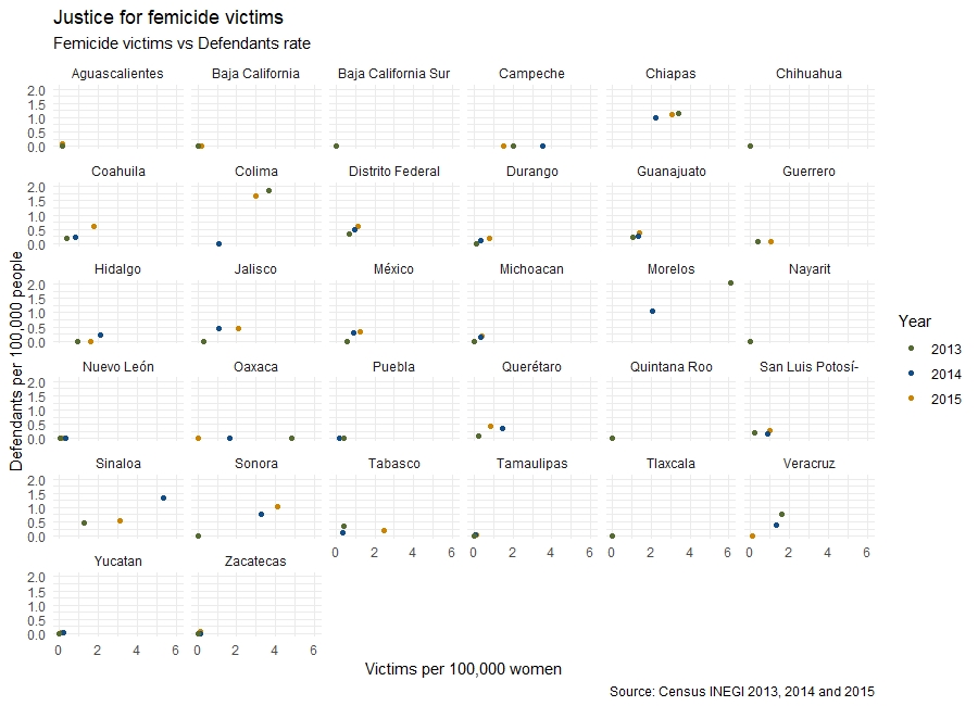
A final facet view of the graphic can be done to show the different variables for each state rather than for each year.
p2<- ggplot() +
  geom_point(data=sub_bd, aes(x = vict_rate , y = defendant_rate, color=as.factor(year))) + #Points' colour regarding the year
  facet_wrap(.~ ent) + #Split  by state
  scale_color_manual(values=c("darkolivegreen","dodgerblue4", "orange3")) + #Colours
  labs(title ="Justice for femicide victims", #Add title
       subtitle="Femicide victims vs Defendants rate", #Add subtitle
       x = "Victims per 100,000 women", y = "Defendants per 100,000 people", #Add names of axes
       caption = "Source: Census INEGI 2013, 2014 and 2015", size="Total Femicides", color ="Year") + #Add name of source
  theme_minimal() #Add theme
You are welcome to use this code to build your own scatter plots.
References.
INEGI, n.d. INEGI. URL https://www.inegi.org.mx/datos/?ps=Programas
RStudio, n.d. Cheat Sheet Data Visualization with ggplot2
